Time
The Time element captures time-specific input in the Doctor App. It includes visual indicators, inline validation, and support for read-only display. Use this field when the user must select or enter a time value, such as during appointment scheduling or when offering alternatives.
Properties
| Property | Value | Description |
|---|---|---|
| Type | Time | UI component type |
| Group | Field | Belongs to the "Field" group in UI catalog |
| Identifier | 50 | Unique element ID |
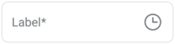
| Preview | ✓ | Displays sample input UI (see image) |
| Value | Y | Accepts time input from user |
| Mandatory | Y | Required in workflows with validation |
| Error | Y | Supports validation error states |
| Min | Y | Can enforce a minimum time |
| Max | Y | Can enforce a maximum time |
| Read-only | Y | Can render as non-editable |
| Text, Icon | Y | Supports label and optional icon |
| Event | Y | Triggers change or validation events |
| Shade | Y | Displays with shaded styling (when enabled) |
| Children | Not a container | |
| List | Not a list item |
Usage Example
<TimeInput
  label="Appointment time"
  required
  min="08:00"
  max="22:00"
  onChange={handleTimeChange}
/>
SDK Integration
The Suggested Scheduling component uses this element. It maps to the SDK method:
Method: /profile/appointments/{id}/details
Used to define the scheduled time for a new or edited appointment. The value must conform to 24-hour time format and respect validation boundaries.
Example UI Placement
| Level | Reference | Type | Value | Description |
|---|---|---|---|---|
| 1 | time~{x} | Time | Time | Required in alternative suggestion |
Notes
- Accepts HH:MM input in 24-hour format.
- Commonly used with the
Dateelement. - Validation errors appear if time is outside min/max boundaries.