Date
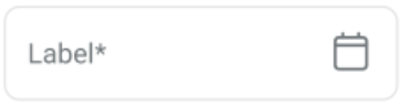
The Date element enables users to select a calendar date from a popover picker. This element supports minimum and maximum date constraints, required validation, and a shaded visual style. Use this element when a form or workflow requires a specific date entry.
Properties
| Property | Value | Description |
|---|---|---|
| Type | Date | UI component type |
| Group | Field | Belongs to the "Field" group in UI catalog |
| Identifier | 9 | Unique element ID |
| Preview | ✓ | Displays calendar popover on interaction |
| Value | Y | Accepts selected date as value |
| Mandatory | Y | Requires input for form completion |
| Error | Y | Displays error for invalid or missing values |
| Min | Y | Supports minimum selectable date |
| Max | Y | Supports maximum selectable date |
| Read-only | Y | Can display in locked or view-only mode |
| Text, Icon | Y | Displays label and calendar icon |
| Event | Y | Triggers updates when date selection changes |
| Shade | Y | Uses shaded background style |
| Children | Does not support nested content | |
| List | Not a list container |
Usage Example
<DateInput
  label="Away until"
  required
  minDate={today}
  maxDate={endOfWeek}
  onChange={handleDateChange}
/>
SDK Integration
The Availability Status screen uses this element when setting a future unavailability period. It links to the SDK method:
Method: /account/doctor/availability-status
Updates a doctor’s status. If the user selects “Away until,” the system displays this field to define the return time. Logic uses the date to calculate availability routing for appointments.
Example UI Placement
| Level | ID | Type | Value | Description |
|---|---|---|---|---|
1 | date | Date | Away until | Defines return date for status setting |
Notes
- Use when workflows require exact day selection.
- Avoid applying date fields when relative duration (e.g. 1 hour) provides better UX.
- Pair with
Radio,Button, andRegularelements for conditional behavior.