Multiselect
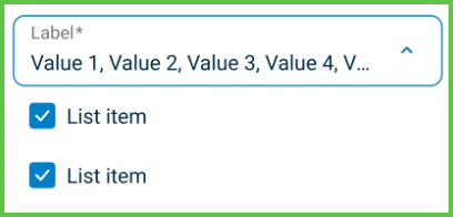
The Multiselect element displays a dropdown list that allows selection of multiple values. It supports read-only display, error validation, placeholder labels, and checkboxes for user clarity. Use this component for filters, preference selections, and categorized tags.
Properties
| Property | Value | Description |
|---|---|---|
| Type | Multiselect | UI component type |
| Identifier | 32 | Unique element ID |
| Group | Field | Part of the Field group |
| Value | Y | Stores selected items |
| Mandatory | Y | Requires input when configured |
| Error | Y | Displays validation feedback |
| Min | Not defined | |
| Max | Not defined | |
| Read-only | Y | Can render in non-editable form |
| List | Y | Renders dropdown with checkable list |
| Text, Icon | Y | Supports label text or icon |
| Children | Does not allow nested components | |
| Event | Y | Emits changes when selections update |
| Shade | Y | Applies styling based on selection state |
Usage Example
<Multiselect
  label="Status"
  options={[
    { value: 'new', label: 'New requests' },
    { value: 'offered', label: 'Offered appointments' },
    { value: 'scheduled', label: 'Scheduled appointments' },
    { value: 'after', label: 'After visit' },
    { value: 'cancelled', label: 'Cancelled / Refused' }
  ]}
  onChange={handleStatusChange}
/>
SDK Integration
The Appointment Filter panel uses this element to refine appointment queries. The selection updates a real-time list in both desktop and mobile layouts.
Method: /profile/appointments/filter
This method filters appointments based on the selected status or other parameters such as date range or patient name.
Example UI Placement
| Level | ID | Type | Value | Description |
|---|---|---|---|---|
1 | status | Multiselect | Appointment status filters | Includes multiple states |
Notes
- Use when multiple related options must be selected.
- Avoid excessive item counts that reduce clarity.
- Pair with clear
ApplyorResetactions in filter contexts.