Embed
The Embed element provides a layout container that hosts another screen or module within a fixed section of the UI. It supports dynamic content loading and responsive layout handling. Embed is primarily used to load default or alternate screens such as appointment filters, welcome panels, or patient details.
Properties
| Property | Value | Description |
|---|---|---|
| Type | Embed | UI component type |
| Group | Group | Used to group embedded content in screen layouts |
| Identifier | 14 | Unique element ID |
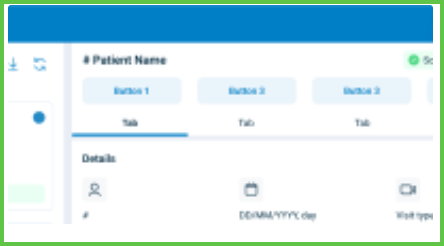
| Preview | ✓ | See image preview above |
| Value | Y | Accepts embedded content or target |
| Mandatory | Not mandatory | |
| Error | No validation errors | |
| Min | No minimum content restriction | |
| Max | No maximum content restriction | |
| Read-only | Editable via layout configuration | |
| Text, Icon | Y | May display section titles or icons depending on context |
| Event | Does not trigger events directly | |
| Children | May contain one or more nested screen components | |
| Shade | Inherits background from parent layout | |
| List | Not a repeatable list container |
SDK Integration
The Appointment Details screen uses multiple Embed elements. Example placements:
{
  "screen": "AppointmentDetails",
  "layout": {
    "D-2": {
      "embed": "appointment-filter",
      "width": "30%"
    },
    "D-2": {
      "embed": "welcome-or-details",
      "width": "70%"
    }
  }
}
Example UI Placement
| Level | ID | Type | Value | Placement Description |
|---|---|---|---|---|
D-2 | appointment-filter | Embed | Appointment list / filters | Left-side panel on desktop layout (30%) |
D-2 | welcome-or-details | Embed | Welcome screen or details | Right-side panel on desktop layout (70%) |
Notes
- Use Embed to inject self-contained views into container layouts.
- Supports dynamic switching of child views via conditional logic.
- Placement percentage is controlled by layout grid configuration.
- Common in split-screen desktop variants where appointment filters and details load side-by-side.