Card
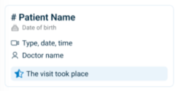
The Card element displays structured content in a bordered container. Cards group related information such as appointment details or suggestions. Use cards to visually separate contextual items like scheduling options, patient summaries, or selectable events.
Properties
| Property | Value | Description |
|---|---|---|
| Type | Card | UI component type |
| Group | Box | Part of the Box container group |
| Identifier | 4 | Unique element ID |
| Preview | ✓ | See image preview above |
| Read-only | Y | Displays static content |
| Children | Y | Supports nested components |
| Event | Y | Can trigger interactions |
| Shade | Y | Uses a shaded background |
| Value | Not a value-based element | |
| Mandatory | Optional element | |
| Error | No validation logic | |
| Min | Not applicable | |
| Max | Not applicable | |
| List | Not a list container | |
| Text, Icon | No label or icon metadata by default |
Usage Example
<Card>
  <Title text="Suggested Appointment" />
  <Text label="Monday, 10:00 AM – Dr. Katz" />
  <Button label="Approve" />
</Card>
SDK Integration
The Offer an Appointment screen uses this element to present appointment options. The card appears again in the Need Another Appointment popup as a reusable scheduling container.
Method: /profile/appointments/{id}/offer-an-appointment
Method: /profile/appointments/{id}/offer-an-appointment/need-another
Each card includes suggested times, context, and call-to-action elements.
Example UI Placement
| Level | ID | Type | Description |
|---|---|---|---|
1 | alternative~1 | Card | Contains the suggested appointment offer |
2 | — | — | May include contextual scheduling content |
Notes
- Use cards to structure complex or repeatable content units.
- Combine with
Text,Regular, andButtonelements for full functionality. - Card elements improve scanability by isolating actionable sections.