Colors
Color elements display appointment statuses or contextual messages using consistent semantic styles. Each color represents a specific meaning—such as success, warning, or error—and is rendered as inline blocks within patient records, summaries, or lists. These elements use visual cues like icons, backgrounds, and accent colors to convey information.
Color Variants
✅ Green – Scheduled Appointment
Represents success or confirmed actions.

| Property | Value | Description |
|---|---|---|
| Type | Green | UI component type |
| Identifier | 21 | Unique ID |
| Group | Text | Part of the Text group |
| Max | Lines | Supports wrapped content |
| Text, Icon | Y | Displays icon + label |
🔵 Blue – Completed Appointment
Represents informational content, such as a completed or past appointment.

| Property | Value | Description |
|---|---|---|
| Type | Blue | UI component type |
| Identifier | 1 | Unique ID |
| Group | Text | Part of the Text group |
| Max | Lines | Allows multiple lines if needed |
| Text, Icon | Y | Displays star icon and label |
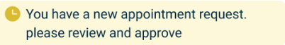
🟡 Yellow – Pending Request
Represents a warning or pending status. Used when action is needed (e.g. doctor approval).
| Property | Value | Description |
|---|---|---|
| Type | Yellow | UI component type |
| Identifier | 56 | Unique ID |
| Group | Text | Part of the Text group |
| Max | Lines | Wraps when content is long |
| Text, Icon | Y | Includes inline icon and description |
🔴 Red – Canceled Appointment
Represents a failure or negative outcome.

| Property | Value | Description |
|---|---|---|
| Type | Red | UI component type |
| Identifier | 40 | Unique ID |
| Group | Text | Part of the Text group |
| Max | Lines | Supports content wrapping |
| Text, Icon | Y | Shows icon and status message |
Usage Example
<Green>Scheduled appointment</Green>
<Blue>The visit took place</Blue>
<Yellow>You have a new appointment request</Yellow>
<Red>Canceled appointment</Red>
SDK Integration
Color elements appear throughout the Appointments List screen and related flows.
Method: /profile/appointments/list
Colors convey status at a glance and enhance clarity for doctors and support staff. These elements often appear alongside Card, Section, Regular, and Count.
Example UI Placement
| Level | Type | Value | Description |
|---|---|---|---|
3 | Green | Scheduled appointment | Confirmed status in card footer |
3 | Blue | The visit took place | Shown after a completed session |
3 | Yellow | New appointment request | Indicates pending approval |
3 | Red | Canceled appointment | Marks canceled or declined slots |
Notes
- Use these color-coded tags consistently across all appointment screens.
- Avoid mixing semantic roles (e.g. using Red for warnings that are not errors).
- Combine with icons and spacing for clarity in list rows and card layouts.